On Land

Environment Information
At Rill Architects we run ArchiCAD on macOS. If you work at Rill, this is your stuff. If you don't, but you work in ArchiCAD, you may find something interesting. Anybody else, I don't know.
RSS
Standards Archive

« Newer | All Entries | 1 | 2 | 3 | 4 | 5 | 6 | 7 | 8 | 9 | 10 | Older »

Details need to be processed before merging them into running projects, or into a details PLN. It is important to avoid merging unwanted attributes, especially layers. This process simplifies the layers and gets rid of all the unneeded attributes.

This method should be considered alongside A Method For Standard Details.

Standard details will be administered by one or two people at the most.

More»

Background RGB
I always forget it, so I'm writing it down.

Hmm, lots of space left. We use beige because everything shows against it: White, black, gray, yellow. Then one day I noticed that our background is almost the same color as buff trace, and it's probably for the same reason. It's interesting how you can go through a completely different process and get the same conclusion as someone 100 years ago or whatever.

What else. In AC8 and before, each window had its own background color. Now there's only one, but the grid color is unique to each window. I'd like to have one detail window with a white background for making object previews.

I'm happy to announce, and I hope I don't regret it, that we can email PDFs to MBC. And they will print them, and the drawings will probably be alright. I'm sure there will be some tuning up to do, but I think we have it working.

This is the address. Put the job details (copies etc) in the message. The file size limit is 50MB.

Let me know if you have any problems.

I found this 90% finished in the Ice folder, so I wrapped it up. The main difference is that the text expansion is now handled as a real number, consistent with the expansion feature of text in AC. The default expansion factor is 2.0.

Also: All the drawing names default to Title Case instead of ALL CAPS. Listen, all caps is played. It's a holdover from the hand-lettering days, which I barely remember. Nobody else in any print, design, or writing field uses caps all the time just because. It is hard to read. It looks like shouting.

Played.

Also, in the future (I'm optimistic), we will use automatic drawing titles. (Yes, they can be automatic in 9, but they're not parametric, and they don't cut it.) The name of the SE marker will be the name of the drawing. I'm not going to look at a Navigator full of CAPS all day.

Bury all caps, not praise.

To facilitate the creation of post-project binders.

More»

Actually, we have been phasing it out for a while. Long ago, it was the default section cut pen for Walls Int and Ext, but that was changed to 15. The same goes for the section cut pen for structural slabs and decks.

So I envision this having very little impact, but I'm giving plenty of warning anyway. I don't know how long exactly. Put it this way, in AC10 it will be official.

Why. We have used pen #1 as a section cut pen, which means it's heavy. Pen #1 turns up as the default pen in a lot of circumstances in AC, and its weight in our setup is not a good default weight in most cases. Therefore, I want to change the weight of pen #1 to something along the lines of pen #12. If you end up with pen #1 by accident, it won't be obnoxiously heavy. But if I change the weight, I need to be sure no one is using it for a section cut pen, or at least we're out of the habit.

So stop using pen #1 when you want a heavy line. Use 15, 25, 35, 45,... instead.

Competition submission materials should be kept in the project folder. This applies to current and past projects.

Under the current template folder scheme, create a folder in 2 Output called 'Competitions'. (The zTemplate folder, as of now, already has this.)

Under the old template folder scheme (01CDs, 02 Reference, etc), create a folder called 'Competitions' at the top level.

Within the Competitions folder, create a folder for each submission, giving the name of the competition. Example: 2 Output / Competitions / Remodeling 2006/.

All files pertaining to the submission should be in there: PLNs, layout books, images, PDFs, forms, etc.

You'll be glad you did!

Sheet S3

Everything in the general framing plan discussion also applies to roof framing plans. There's a few special considerations:

• The roof framing plan should usually be generated from the top occupied story, not the roof story. For most projects, this is either the attic or the second floor. In the past, we have used the roof story, but not any more. It is very beneficial to show walls in the roof framing; in fact, we should show walls from multiple stories where applicable. By using an occupied story for the plan, it's one less story to be shown using the trick linked above.

• Show the outlines of the roofs. It is not feasible to show the roofs themselves, you must trace them or copy and paste from the 3D window in the classic style.

If you are showing the actual roofs in your architectural roof plan, put the traced/pasted roof lines on the +S Struct Note layer. If you are using the cut and paste method for the architectural roof plan, you can use the same lines for roof framing.

If you have dedicated structure roof lines (not reused in architectural), change the hips and valleys to a dashed linetype.

To put it another way.

Option 1 (preferred): Use roof elements on A Roof2 for the architectural roof plan. Use copied lines for the roof framing, on +S Struct Note. Switch the hip and valley lines to dashed.

Option 2: Use copied lines for the architectural roof plan, on +A Roof Plan Line. The same lines show in the roof framing. You can't do the dashed line thing.

• If hip and valley framing members are modeled, they require special attention to place them right. It's often OK to show these members as 2D only. There are two ways to do this: 1) The wood beam object has an option to turn the 3D off. 2) Put the beams on the S Framing layer, which is hidden in section.

For the last couple weeks, spying on people, I've noticed separator lines showing up in framing composites. I don't know how this happened, but it must be my fault, but you still have to fix it.

This is what I'm talking about:


Bad


Good

Even worse, it seems the separators got set to pen #1, which is just extremely bad.

More»

Sheet S1
Rules for framing plans. Foundation plans are slightly different. Roof framing plans are very similar. I'll have a separate note for them. I wonder what the difference between 'slightly different' and 'very similar' is.

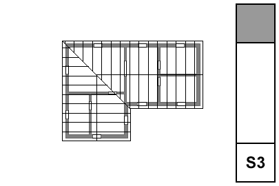
• Walls. Display of walls is controlled by Display Options. The 'Cut Fills' option should be set to 'Separators Only'. The walls will be clear, with lines at the separators; for example, between concrete and stone. Use the 'S' Display Option Combination.

• Bearing Walls. To show a bearing wall, draw a fill on top of it. This is a non-associated, additional element. Use the fill '*Masonry Block', with a background pen of 50. Use the layer +S Struct Note. So: Walls are clear, except bearing walls, which are shaded.

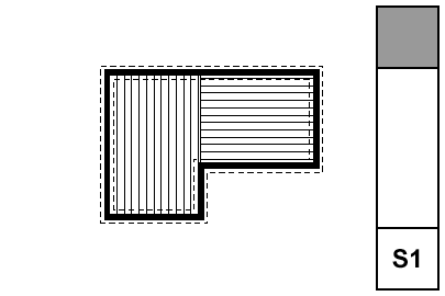
• Rafters & Joists. Fill elements of the fill 'Joists 16OC' or 'Joists 12OC'. If you need other spacings, you need to make more fills. The fills go on the layer S Framing, which only shows in the framing plans. Rafter and joist placement is diagrammatic.

• Rafter & Joist Labels. Object 'Joist Note JAM9'. With the joists shown as fills, you don't need to show the extent in the note object, although it has that option.

• Beams. Beams should generally be modeled and labeled in sections. Use the objects Wood Beam JM9 and Steel W Shape Beam JAM9, etc. Most beams should be on the layer S Beam, which shows in section. If the beam is just used as a note, place it on S Framing.

Beams can reference their calculations by use of the ID tag in the objects.

• Annotations. All annotations should go on the layer +S Struct Note, unless you want an annotation to show in the foundation plan simultaneously. In that case, use +S Note All. Use a background of pen 91 on text blocks to make them readable when placed on fills.

• Structure Notes. Loads, criteria, etc. are part of the General Notes PDF. Specific notes can be added to the plans using text blocks.

All these are set up in the templates and favorites. If you notice Arial anywhere, you are missing a font on your system. If there's Arial and you don't notice it, consider getting a job using AutoCAD.

Notes & Labels: Lucida Sans

Dimensions: Tahoma

Drawing Titles and Plan Titles: Times

Drawing Number in Title: Futura

Drawing List: Lucida Sans

Room Name: Times

Sheet Number: Futura

Title Block Data (Except Firm Name): Ocean Sans Std Light

Title Block Firm Name: Times

Project Title (Cover Sheet): Goudy Old Style

Starting with AC 10, we will use 'real' section markers.

When we started with AC 5.1, there were fixed section marker styles. (Like the fixed dimension ticks and arrowheads to this day.) We didn't like the available styles, so we adopted the policy of showing sections in plan with an object, independent of the SE cutting element. The independent object also means we can fudge the placement of the marker, rather than being bound to its actual extent. And we can have that two-headed marker option.

In 8 (I think), they instituted GDL section markers, so we can in principle make markers any way we want. In practice, scripting SE markers is rather quirky, and I decided to punt, waiting to see if it would improve.

The main disadvantage of the independent object is that you need a workaround to refer to the drawing in the set.

In 10, they have overhauled tweaked the reference method internally. It's mostly good, but the workaround linked above is actually made worse. I can't take it anymore.

And no, the scripting is still weird. In 10, SEs have visible hotspots that aren't detectable. Gimme a break. But on balance the time is now to switch to real sections.

Summary.

Object Pros: Total scripting control. Flexibility in graphic placement. Cons: Awkward drawing referencing. People think we're weird.

Real SE Pros: Unity. More intuitive, not fighting the program. Automatic referencing. Cons: Less graphic flexibility.

Standards and template updates are below the fold.

More»

« Newer | All Entries | 1 | 2 | 3 | 4 | 5 | 6 | 7 | 8 | 9 | 10 | Older »