
Standard pens updated for Archicad 25. More on pen sets here.
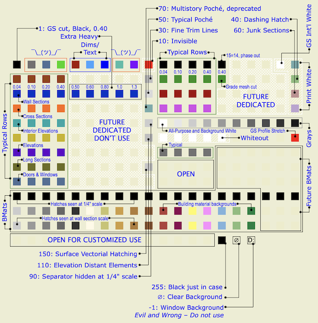
Color Hatch set, typical for working
Typical Rows
Most work is done using the typical rows. The first pen is thinnest, at 0.04mm. Each successive pen is slightly thicker, up to 0.4 mm for the fourth. With some exceptions, the rest of the row is not used.
For typical rows, the pens ending in the same number are the same weight. 11, 21, 31, 41, etc. are all the same, and they all turn black in layouts, where you can't tell them apart. Use the colors to differentiate parts of the model. Within the colors, set the line weight. Be consistent in what colors you use for different purposes. The favorites are set up like this:
Walls: Black (10s)
Roofs: Cyan (80s)
Doors & Windows: Blue-gray (160s)
Soffits & Ceilings: Orange (60s)
Panel walls: Yellow (110s)
Counters: Purple (120s)
Stairs: Brown (20s)
3D stairs, decks, terraces: Dark Red (50s)
Appliances, fixtures, misc objects: Green (30s)
Main crown: Pink (70s)
Structure elements: Olive Green (140s)
I recommend using the blue 40s row for 2D only. This way, when you see a blue line, you know it isn't part of a 3D element.
When using the same color for different types of elements, make sure the types are spatially and conceptually separate. You can use your roof color for trim, but if you used it for ceilings it would get confusing.
For trim elements, use a different color for each type. I make the main crown pink and the baseboard dark red. If there's a chair or picture rail, I'll use cyan. This makes it easier to tell them apart when they're all stacked together.
We also use the colors to tell the sections and elevations apart:
Exterior elevations: 123 (purple)
Long sections: 33 (green)
Cross sections 63 (orange)
Interior elevations: 83 (cyan)
Wall sections: 43 (blue)
Sometimes you have to cut a section just to generate a detail; I use pen 53 (dark red) for those.
Many CAD standards use color to represent output line weight. This is a help in drafting but is useless for model building. The most important issue for us is maintaining order and telling what is what. By using matching colors for the plan, section, and fill pattern pens, an element will be recognizable from any point of view.
Fill patterns in section (brick, stone, etc) should have pen 11 (or 21, 31, 41,...). A very fine fill might go one notch heavier. Composite separators that aren't set to 'hide' should have pen 12 (or 22, 32, 42,...). Edges in plan, such as counters and stair treads can use 12 or 13 (23, 33, 43,...). Weight 14 (24, 34, 44,...) is used for cut elements, usually walls and columns, in plan.
Some rows have more pens defined. These are dedicated pens for a specific purpose - more on this in a minute. In the future, we will likely find more applications for dedicated pens, and these will be defined in the currently unused parts of the typical rows. In the meantime, the unused pens are beige, and we don't use them.
The First 10
Ideally, we want to leave the first ten pens alone, because they are used in Archicad library objects. If we use those objects, they need to look right without us fiddling with all the pen settings every time.
That said, we do use few of the first ten, for no better reason than we always have. Since one of the goals is to minimize disruption, I'm not going to place the whole row off-limits for an abstract reason.
• We do not use pen #1. It has a section cut weight, but elements should use the cut pen from their own rows. And it shouldn't be used for anything else. Every once in a while, it will turn up as a default in a weird place (schedules, grids), and it's always too heavy.
• We use pen #2 (gray) for structural slabs in plan. Framing decks are black, and I like to be able to tell which is which. These elements never show in output plans, so the weight isn't an issue. (Structural slabs use 11 and 15 in section.)
• We use pens #6 & #7 for dimension witness lines and ticks respectively. The weights are customized for this purpose. If you customize a dimension text, change the pen to #5. I wish this could happen automatically.
• We use #7 for text. Again, it's just tradition at this point. Note that weight doesn't matter with respect to text.
• We use pen #10 for drafting help.
Grayscale
Pens 91-100. A full grayscale range in 10% increments.
White Pens
Pens 20, 40, 60, and 80 are all white in output. I use 60 for junk sections. (Important: If a junk section becomes non-junk for some reason, change the pen.) Pen 40 is a special heavy weight for creating dashed lines using a diagonal fill. I use 80 for white masking fills. Use these pens for anything you want to see but not be distracted by, or anything that needs to not print but you want to see in the model environment.
Pen 10 is, again, drafting help.
For white white, use pen 91, and no other. And, never change the color of pen 91. The whiteness of 91 is deeply embedded in Archicad culture. Most (all?) US library parts with white in their symbols use this pen, because it's a given that no one will change its color. Other white pens, you can't be sure.
Pen 19 is white for compatibility with international library parts, should you ever come across one. You can ignore it otherwise.
The 180s row are the 'whiteout' pens. They match the weights of a typical row, so you can draw a white (invisible) line over an unwanted model line.
Dedicated Pens
Pen sets mean that we can use pens to control some display behaviors that are difficult or impossible any other way. In order to have that control, we need to be very consistent in the use of pens we want to switch around.
A 'dedicated pen' is a pen you must use for a certain condition, and you must not use it for anything else.
Here's a table of the dedicated pens as it stands now:
| Pen | For | What's the deal | |
| 6 | Dimension Lines | Non-standard weight | |
| 7 | Dimension Ticks | Non-standard weight. Can be used for text. | |
| 10 | Non-printing drawing help | Red in model, white (invisible) in output | |
| 19 | Default white of AC international libraries | White in all sets | |
| 30 | Fine trim lines | Gray in model, black hairline in output | |
| 35 | Cut line of grade mesh | Extra Heavy | |
| 50 | Poche background | Gray in all model/output except white in wall section | |
| 91 | Primary white pen; Default white of AC US libraries | White in all sets | |
| 110 | Distant elements | Gray in model, black hairline in output | |
| 120 | Profile stretch boundaries | Red, can't be changed due to bug | |
| 150 | Surface cover fill hatch pen | Thin gray in all sets |
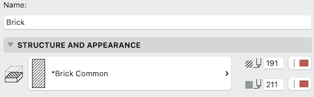
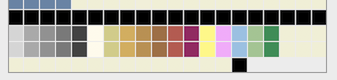
Building Materials
The three rows of pens from 181 to 240 are reserved for building materials.
We work in color. Using colorful materials provides clarity and helps to figure out construction modeling. We generally output black/white/grayscale, because that's what most people can print. Reducing all the poche to gray also hides cleanup issues.
Building material cut fills have a fill pen and a background pen.
The middle row of the three provides the background pens.
The top row is for 'coarse' hatch patterns that are shown in most output, including 1/4" scale. These are mostly concrete and masonry.
The bottom row is for 'fine' hatch patterns that are shown at large scales. These are everything else, such as wood grain and insulation.
(This method is a modification to that used in the Shoegnome template.)
Using pen sets, we can make the hatches show or hide, and change the color of the whole material.
When working, the colors are shown along with the coarse hatches, which makes the parts of the construction clearer for the user. Because the fine hatches match the background, they are invisible.
Color backgrounds, coarse hatches shown
When working in wall sections, you can turn on the fine hatches.
Color backgrounds, all hatches shown
For PDF output at 1/4" scale (48), the coarse hatch pens (for masonry, etc.) are black, the background pens are Classic Poché Gray, and the fine hatch pens are also gray, which makes them invisible.
Gray backgrounds, all hatches shown
For PDF output at Wall Section scale (16), both the coarse and fine hatch pens are black, the background pens are white. Using white background in wall sections makes the hatches clearer. (The two gray background pens are explained below.)
White backgrounds, all hatches shown
So we have meaningful colors for Bmats, which can be turned to grayscale for PDF output.
And we have two kinds of hatch pens, which can be either distinct from the background to show, or match the background to be invisible.
The other factor in output cleanup is the display of composite separators. Some separators should always show, and those should be pen 12. Other separators are switched between black and gray, visible and invisible. Those separators use dedicated pen 90.
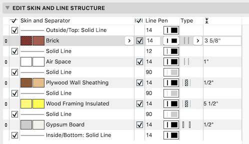
The plywood and GWB Bmats don't have a hatch pattern. These fills simply don't read in wall section. Instead, the pens used for these Bmat backgrounds are light gray in wall section. (These are the two gray pens in the white row above.) This makes up for the missing air line and it looks cool. Have you ever seen good CAD stippling? Neither have I.
The pen set strategy is needed because graphic overrides aren't good enough. GOs can't override attributes, only elements. And they can't change portions of elements, only the whole thing. If GOs are updated to allow this, most of the color switching could be handled there instead.
Graphic Compromises of this Bmat Method
Graphic Compromise #1: The air line in Archicad doesn't work. I don't know why, but if they wanted to fix it, they would have by now. Here is what you want: A perfect heavy line all around the cut edges in a section, with no heavy lines within the structure. You can't get this automatically. We have done pretty well with this over the years with a lot of fiddling. (NB: Fiddling isn't automatic.) Not perfect, but tolerable.
Using real Bmats makes this situation worse. It's a big reason we have stuck with the Empty Fill method for so long. But the advantages of real materials are great enough that it's time to let the air line go.
In sections, including wall sections, there is no distinction between edges that face air and edges that face other materials. The only way to get rid of the random heavy line on the interior is to get rid of all the heavy lines.
Graphic Compromise #2: I can't get the 1/4" framing poché perfect. Even though all the Bmats turn gray from the pen set, there are still lines between some parts of the section where we wish they weren't. All I can do is make those lines appear at sensible places, and make them not heavy.
These are really both air line problems.
About Pen 255
You would probably never use pen 255 on purpose - there are lots of open pens before it. It's black in the table instead of anonymous beige so in case you use it by accident, you get black output instead of nearly invisible output. How can you use it by accident? By typing a number larger than 255 into a pen field. If you mean 32 but type 322, the number will revert to 255. Now despite the mistake you will still get output. Its weight is medium.
Special Background Pens, Featuring Evil
The last two pens don't appear in every pen selector and can't be modified by the user. They are dedicated to fill backgrounds. If you put any normal pen as a fill background, the fill will be opaque (assuming model view options are set that way). We typically use pen #91 (white) for this. To have the fill background transparent, use pen 0, also shown as Ø.
The other one, pen -1, should not exist. From this you can deduce that you should never use it. This pen makes the fill background the same color as the window background. I have never encountered an appropriate use for this feature.
One of the reasons we use a beige window background is so we can use white for fill backgrounds, which is their output color, while still being able to see them. White is something (but invisible) while the window background is nothing. If the masking matches the background, you can't tell the nothings from the invisibles. So I really recommend a non-white background, though Archicad is white out of the box. (Not black either, that's perverse.)
Pen -1 undoes this advantage, without telling the user. Here's nothing, it's beige. Here's something invisible, it's white. Oh, now here's a beige thing that's something invisible. WHY?
All pen -1 does is hide elements' invisibility from the user. There is no case for this, ever. It has no effect on output, unless you count the greater risk of errors from working in a defective environment.
(The actual purpose of this pen is for predictable results when AutoCAD users open your DWGs. This isn't a good enough reason to do anything.)
Unfortunately, while you must never use this pen, you do have to deal with it. Because the only thing worse that having this pen at all is making it the default for the background of every 2D symbol in the Archicad library.

Here, let me make it look like there is nothing under this object
So when you use these parts, change that pen to #91. Where Archicad parts are saved as favorites, this is already done.