
Standard pens updated for AC11.
Changing the pens is a pain, and it's potentially disruptive. I try to avoid it. With this update, I'm trying to minimize disruption while building a system that can adapt in the future. It should hold us for a while.
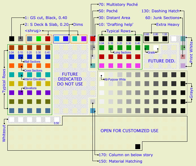
Pen table in model...layout...
Goals for this Revision
• Minimize disruption to running projects and libraries. To this end, all the important pens are unchanged.
• Only change pens that are unused or slightly used.
• Make AC library parts fit our weights, so when we use their objects they look right.
• Develop a place for dedicated pens, because in the future there will be more of them.
• Make clear which pens not to use.
Changes in this Revision
• Shorter typical rows: 5 pens. Some rows have more for dedicated purposes.
• Slightly lighter weights for 4 and 5 columns. The new weights are 0.04, 0.1, 0.2, 0.3, 0.4mm.
• 140 becomes a typical row, olive green. I'm using it for structure beams. Nobody used that gray row.
• Whiteout pens move to the 180s row.
• 19 is white for compatibility with international Archicad library parts, should you ever encounter them.
• Unused pens are all beige.
• Pen descriptions used throughout.
• Pen 70: Multistory poche. Prints same as 50.
What Doesn't Change
Typical rows, grayscale, pens dedicated to poche and surface patterns. This is 99.99% of everything. Give or take.
Typical Rows
Most work is done using the typical rows. The first pen is thinnest, at 0.04mm. Each sucessive pen is slightly thicker, up to 0.4 mm for the fifth.
For typical rows, the pens ending in the same number are the same weight. 11, 21, 31, 41, etc. are all the same, and they all turn black in layouts, where you can't tell them apart. Use the colors to differentiate parts of the model. Within the colors, set the line weight. Be consistent in what colors you use for different purposes. These are my habits:
Walls: Black (10s)
Roofs: Cyan (80s)
Doors & Windows: Blue-gray (160s)
Soffits & Ceilings: Orange (60s)
Panel walls: Yellow (110s)
Counters: Purple (120s)
Stairs: Brown (20s)
3D stairs, decks, terraces: Dark Red (50s)
Appliances, fixtures, misc objects: Green (30s)
Main crown: Pink (70s)
Structure elements: Olive Green (140s)
When using the same color for different types of elements, make sure the types are spatially and conceptually separate. You can use your roof color for trim, but if you used it for ceilings it would get confusing.
For trim elements, use a different color for each type. I make the main crown pink and the baseboard dark red. If there's a chair or picture rail, I'll use cyan. This makes it easier to tell them apart when they're all stacked together.
We also use the colors to tell the sections and elevations apart:
Exterior elevations: 122 (purple)
Long sections: 32 (green)
Cross sections 62 (orange)
Interior elevations: 82 (cyan)
Wall sections: 42 (blue)
Sometimes you have to cut a section just to generate a detail; I use pen 52 (dark red) for those.
Many CAD standards use color to represent output line weight. This is a help to drafting but is useless for model building. The most important issue for us is maintaining order and telling what is what. By using matching colors for the plan, section, and fill pattern pens, an element will be recognizable from any point of view.
Fill patterns in section (brick, stone,etc) should have pen 11 (or 21, 31, 41,...). A very fine fill might go one notch heavier. Composite separators that aren't set to 'hide' should have pen 12 (or 22, 32, 42,...). Edges in plan, such as counters and stair treads can use 12 or 13 (23, 33, 43,...). Weight 15 (25,35,45,...) is used for cut elements in plan and section. I didn't forget 14 (24,34,44,...), it's used for the cut pen on elements that are either thin, curvy, or small, which makes the 15 weight appear heavy.
Some rows have more pens defined. These are dedicated pens for a specific purpose more on this in a minute. In the future, we will likely find more applications for dedicated pens, and these will be defined in the currently unused parts of the typical rows. In the meantime, the unused pens are beige, and we don't use them.
The First 10
Ideally, we want to leave the first ten pens alone, because they are used in Archicad library objects. If we use those objects, they need to look right without us fiddling with all the pen settings every time.
That said, we do use few of the first ten, for no better reason than we always have. Since one of the goals is to minimize disruption, I'm not going to place the whole row off-limits for an abstract reason.
• We do not use pen #1. It has a section cut weight, but elements should use the cut pen from their own rows. And it shouldn't be used for anything else. Every once in a while, it will turn up as a default in a weird place (schedules, grids), and it's always too heavy.
• We use pen #2 for structural decks and slabs in plan. Because we always have and I don't know what to change it to. These elements never show in output plans, so the weight isn't an issue. (Structural slabs use 11 and 15 in section.)
• We use pens #6 & #7 for dimension witness lines and ticks respectively. The weights are customized for this purpose.
• We use #7 for text. Again, it's just tradition at this point. Note that weight doesn't matter with respect to text.
• We use pen #10 for drafting help.
Grayscale
Pens 91-100, 111-120, 131-140, 151-160, 171-180. A full grayscale range in 2% increments.
White Pens
Pens 20, 40, 60, and 80 are all white in layouts. I use 20 for junk sections. Pen 60 is a special heavy weight for creating dashed lines using a diagonal fill. I use 80 for white masking fills. Use these pens for anything you want to see but not be distracted by, or anything that needs to not print but you want to see in the model environment.
Pen 10 is, again, drafting help.
For white white, use pen 91, and no other. And, never change the color of pen 91. The whiteness of 91 is deeply embedded in Archicad culture. Most (all?) US library parts with white in their symbols use this pen, because it's a given that no one will change its color. Other white pens, you can't be sure.
(Actually, in the international version they changed the universal white pen to 19. They tried to foist that on the US but we pushed it back. Wow talk about disruptive. That's the kind of goofy mistake you make when you put the internal elegance of the system ahead of real life work.)
Pen 19 is white for compatibility with those international parts, should you ever come across one. You can ignore it otherwise.
The 180s row are the 'whiteout' pens. They match the weights of a typical row, so you can draw a white (invisible) line over an unwanted model line.
Dedicated Pens
Pen sets mean that we can use pens to control some display behaviors that are difficult or impossible any other way. In order to have that control, we need to be very consistent in the use of pens we want to switch around.
A 'dedicated pen' is a pen you must use for a certain condition, and you must not use it for anything else.
There are two reasons we would want a dedicated pen:
You need a heavier pen than those in the typical rows. This doesn't happen often. That's why the rows are shorter. We just don't need 25 super heavy pens. The special heavy pens are:
• 36: For the section cut pen of the grade mesh. This line should be heavier than the general cut weight, but you only need one pen to draw it.
• 16, 17, 18. General-use heavy pens for unforeseen circumstances. 0.6mm, 0.8mm, 1.0mm respectively.
• 186: For whiting out the grade mesh section cut line. This means you could do without the Grade Mask object.
Visibility control. Usually, turning a gray or black pen white. Examples: Poche in wall sections, Grade fill except in wall sections, surface hatches in site plans.
Here's a table of the dedicated pens as it stands now:
| Pen | For | What's the deal | |
| 6 | Dimension Lines | Non-standard weight | |
| 7 | Dimension Ticks | Non-standard weight. Can be used for text. | |
| 10 | Non-printing drawing help | Red in model, white (invisible) in output | |
| 15 | Cut pen of architectural walls | Can be grayed for backgrounds | |
| 19 | Default white of AC international libraries | White in all sets | |
| 30 | Marked distant area elements | Gray in model, black hairline in output | |
| 36 | Cut line of grade mesh | Extra Heavy | |
| 37 | Fill pen of grade mesh | White in all model/output except black in wall section | |
| 50 | Poche background | Gray in all model/output except white in wall section | |
| 70 | Poche background for multistory | Blue in all model, gray in output except white in wall section | |
| 91 | Primary white pen; Default white of AC US libraries | White in all sets | |
| 150 | Surface hatch pen: Cover fills, material hatching | Thin gray in all sets except 'White Cover Fills' | |
| 170 | Structure columns on story below | Blue in *Model, black in framing plan output, very light gray in other output | |
| 186 | Whiteout for mesh cut lines | Extra heavy to match 36 |