On Land

Environment Information
At Rill Architects we run ArchiCAD on macOS. If you work at Rill, this is your stuff. If you don't, but you work in ArchiCAD, you may find something interesting. Anybody else, I don't know.
RSS
September 2005 Archive

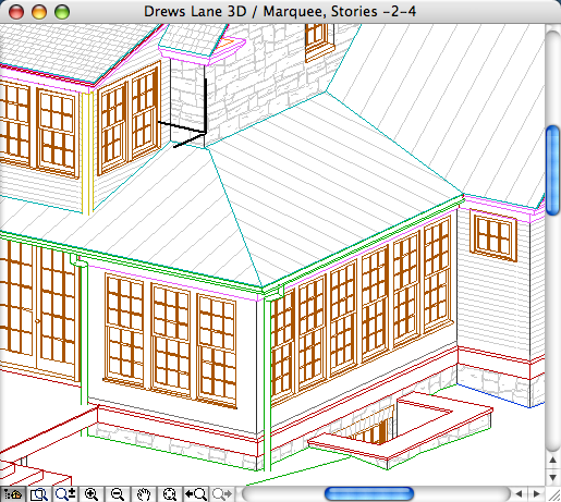
Starting with AC 10, we will use 'real' section markers.

When we started with AC 5.1, there were fixed section marker styles. (Like the fixed dimension ticks and arrowheads to this day.) We didn't like the available styles, so we adopted the policy of showing sections in plan with an object, independent of the SE cutting element. The independent object also means we can fudge the placement of the marker, rather than being bound to its actual extent. And we can have that two-headed marker option.

In 8 (I think), they instituted GDL section markers, so we can in principle make markers any way we want. In practice, scripting SE markers is rather quirky, and I decided to punt, waiting to see if it would improve.

The main disadvantage of the independent object is that you need a workaround to refer to the drawing in the set.

In 10, they have overhauled tweaked the reference method internally. It's mostly good, but the workaround linked above is actually made worse. I can't take it anymore.

And no, the scripting is still weird. In 10, SEs have visible hotspots that aren't detectable. Gimme a break. But on balance the time is now to switch to real sections.

Summary.

Object Pros: Total scripting control. Flexibility in graphic placement. Cons: Awkward drawing referencing. People think we're weird.

Real SE Pros: Unity. More intuitive, not fighting the program. Automatic referencing. Cons: Less graphic flexibility.

Standards and template updates are below the fold.

More»

Build it like they build it except when you can’t.

Stay organized. Be consistent.

Don’t draw anything you can model.

Do everything as needed. Meet the demands of the current situation. If you can’t see it, put it off.

Throw down an element, then fix it.

Fix the mistake when you see it. Fix the whole mistake. Find & Select.

Print. Color is misleading. Your eyes and monitor are only so good.

This technique is for wainscot, or glazing areas where the trim of multiple window units runs together. Short version: a thin wall with empty openings. It's a good example of 'throw down and fix'. Here's the subject structure:


More»

In the Archicad library, there are niche objects, such as W Niche and W Niche Round. These are actually windows. They are built on the WALLNICHE GDL statement. The trouble with these niches is that with the Doors & Windows display option set to Hide on Plan or Reflected Ceiling, they appear to be full, through-wall openings. In addition, they may not handle composite walls correctly.

This is fine:


But when you turn the Doors & Windows off, you get a misleading graphic:


Instead, try a slab and an SEO subtraction.

More»

This layer is for operator elements which you would like to show in plan.

Example: You can use the filleted disc and box objects to cut a ceiling, and display those cutting elements in the plan with a dashed line. You still have to draw them over in the RCP, but two elements is better than three.

Another example: A slab subtracted from a wall to make a niche.