The Work Environment offers the ability to export the keyboard shortcuts as a web document. So why not. Here it is. This link will stay on the Standards section of the sidebar over there on the left. If any of these don't work for you, you can import the current shortcuts from 3 Resources / AC / Work Environment / Rill [version] / Shortcuts.

A Flue is for modeling chimney flues. It shows in plan and section. In section, the layer should be wireframe to show the flue void. In general use, elements on the A Flue layer will be subtracted from each part of the Fireplace/Chimney. The templates have a new layer combination, 'View Flues', which shows the flues solid inside the wireframe chimney.
A Chimney3 is for chimney parts that should not show in plan. Formerly we used A Wall Hi for this purpose. Putting these elements on their own layer allows you to show an axonometric of just the chimney. The templates have a new layer combination, 'View Chimney', which shows the chimney solid by itself. You can use a marquee to create a cutaway axon to show the flues.
Everybody knows this, right?
Do not use the "Cloud" objects in the Archicad library. They are the worst objects in the world. Update: I killed these with my bare hands. They're gone and you needn't fear them any more.
Clouds should be drawn with a closed spline using the "cloud" linetype. The only glitch is that sometimes the cloud will be inside out when you are done. If this happens mirror the cloud, or, if the shape is non-mirror-friendly, draw the spline again, in the opposite direction. Sometimes the spline doesn't quite close. Pretend not to notice.
For the triangle, use the object Character+Shape JAM8 Shape Tag JM9. The number comes from the ID.
Bad cloud. Looks like a chunk of foam rubber from an AirTran pillow. Also missing marker.
Pretty cloud, reminds one of heaven.
Current naming standards. Still very boring.
These rules aren't set in stone, but if we all stay near the rules we all stay near each other. Like all standards, they work MOST of the time. If a situation is addressed by the standards, save your creativity for the projects.
Every drawing or set we give to someone else should be archived as a PDF in the project folder at 2 Output : PDF Archive. This is for convenience and our own protection.
Archives should be named with the date, and a description if the set is for a specific purpose, such as a permit set. Example: Somebody 2005-03-11 Permit.PDF.
In OS X, PDFs can be created from any print dialog by clicking the Save As PDF button.
PDFs saved in this way will be single files with all the printed sheets in them.
You can use PDFs to send drawings to consultants, if they just want to view the drawings and don't need CAD data. If they need actual drawing stuff, you need to send DWGs.
You can view drawing set PDFs using Adobe Reader or Preview, the OS X PDF viewer. Preview is generally better.
(I solved the screenshot problem by taking fewer screenshots.)
Pen table in Archicad...PM...
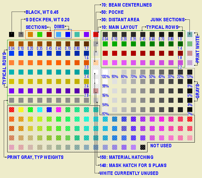
• Most work is done using the typical rows. The first pen is thinnest, at 0.04mm. Each sucessive pen is slightly thicker, up to 0.8 mm. The pens darken very slightly from left to right. The color change should not be apparent in general use.
For typical rows, the pens ending in the same number are the same weight. 11, 21, 31, 41, etc are all the same, they all turn black in layouts, where you can't tell them apart. Use the colors to differentiate parts of the model. Within the colors, set the line weight. Be consistent in what colors you use for different purposes. These are my habits:
Walls: Black (10's)
Roofs: Cyan (80's)
Doors & Windows: Brown (20's)
Soffits & Ceilings: Orange (60's)
Panel walls: Yellow (110's)
Counters: Purple (120's)
3D stairs, decks, terraces: Dark Red (50's)
Appliances, fixtures: Green (30's)
Main crown: Pink (70's)
When using the same color for different types of elements, make sure the types are spatially and conceptually separate. You can use your roof color for trim, but if you used it for ceilings it would get confusing.
For trim elements, use a different color for each type. I make the main crown pink and the baseboard dark red. If there's a chair or picture rail, I'll use cyan. This makes it easier to tell them apart when they're all stacked together.
Many CAD standards use color to represent output line weight. This is a help to drafting but is useless for model building. The most important issue for us is maintaining order and telling what is what. By using matching color for the plan, section, and fill pattern pens, the element will be recognizable from any point of view.
Fill patterns in section (brick, stone,etc) should have pen 11 (or 21, 31, 41,...). Composite separators that aren't set to hide should have pen 12 (or 22, 32, 42,...). Use a 13 (23, 33, 43,...) weight pen for edges in plan, such as counters and stair treads. Weight 15 (25,35,45,...) is used for cut elements in plan and section. I didn't forget 14 (24,34,44,...), it's used for the cut pen on elements that are either thin, curvy, or small, making the 15 weight seem too heavy.
The heavier pens in each row are there if you need them. You usually don't, and having so many is overkill, but we don't need the space. I use pen 36 instead of 35 for the cut pen of a site mesh, so the grade line is heavier.
The last pen of each typical row is consistent in color but not in weight. Each n9 pen is 0.2mm thicker than the previous; 19 is 1.0mm, 129 is 2.8mm. See image.
• Pen 1 is black. It has the same weight as pen 15. Pen 2 is an anomaly, we shouldn't use it but we do. It has the weight of pen 13. We use it for structural slabs and decks in plan. In section, these slabs use pens 11 and 15.
• Pens 3 through 9 are used for differentiating things that don't print, and therefore don't need a particular line weight. Especially S/E elements. I organize my sections like this:
Exterior elevations: 9 (purple)
Long sections: 4 (green)
Cross sections 3 (orange)
Interior elevations: 6 (cyan)
Wall sections: 7 (blue)
Sometimes you have to cut a section just to generate a detail; I use pen 5 (dark red) for those.
Pens 6 & 7 are used for dimensions. They have special weights and your dimensions won't look right with other pens.
• Multiples of ten are an odd group. They used to be mostly white, but lately we've found the need for several dedicated pens, and this is where they are.
Pen 10 is the primary guideline pen. It is white in PM.
Pens 20, 40, 60, and 80 are all white in PM. I use 20 for junk sections, and 80 for white masking fills. Use these pens for anything you need to see but not be distracted by, or anything that needs to print white but be visible in Archicad.
Pen 30 is for the marked distant area of a section. It is gray in Archicad, and plots as a fine black line. When using marked distant area, always "Use One Pen" and choose pen 30.
Pen 50 is the dedicated poche pen. It should be the background color of most cut elements in new construction.
Pen 70 is light orange, and is intended for beam centerlines. The default was white, but they were hard to see. It plots white, and the display options turn the beam centerlines off for output anyway.
Pens 90 & 110 are white. They don't have any particular purpose as of yet. Don't use them. When you need a white pen that's white, use pen 91. It will never change.
Pens 100, 120, 140, 160, 180 are part of the grayscale pens.
Pen 140 is a thick, white pen for making wall-masking hatches for structure plans. More on this later.
Pen 150 is for material (surface) fill patterns. This means cover fills, 2D floor finish fills, and the vectorial pen of materials.
• Pens 141-149 match the weights of a typical row, but they plot at 50% gray.
• Pens 91-100, 111-120, 131-140, 151-160, 171-180 are the grayscale pens. They plot as they are seen in Archicad.
Again: For white white, use pen 91, and no other. Also, never change the color of pen 91. The whiteness of 91 is deeply embedded in Archicad culture. Most (all?) library parts with white in their symbols use this pen, because it's a given that no one will change its color. Other white pens, you can't be sure. Eg, pen 30 used to be white, now it's not.
• Pens 161-170 & 181-255 are not used. Archicad provides 255 pens for compatibilty with AutoCAD; it's really too many. Pen 255 is black in case you put in a pen number greater than 255 by accident, which gives you pen 255. If this pen were a color, it would print in color, causing your plots to have gray lines.
• Switch the title block to the RND9 version. Required. Use Cmd+Opt+click on the new object to retain settings. This is very important. If it fails, that is, you get the new object with default settings, cancel out of the settings box and try again. Delete all the hotspots. Place new hotspots in the sheet number box and the corners of the main drawing area.
• The grays as they come out of the new plotter are all darker. This affects the gray poche in the walls, etc. and the gray lines we use for floor and material fills.
The poche is a little dark, but we can live with it. If you change it it will look better, but it's a chore: You must change the fill background color of all 3D building elements (walls, roofs, slabs), and the background color of all the skins in composites whose settings are used in elements, and the fill color/background color of any masking fills, and the fill color/background color of any objects that show poche in plan or section, keeping in mind that some of them have special parameters for these fills. A chore. If you choose to go through with it, use pen 50. This is our new, dedicated poche pen. The idea is to make the next gray revision simpler; with a dedicated pen, we can just change the color of it rather than the settings of dozens of elements. I wish I'd thought of it sooner. So, poche pen change: Optional.
The fills, however, aren't quite OK. They should be changed to pen 150*. Strongly recommended. The fills include:
1. Fill elements, many of which will be on the F Floor Fin2 layer. Use find and select, on each story, for fills with pen 93.
2. Cover fills on 3D elements, including slabs, roofs, meshes. Do this in the 3D window to get all the stories at once.
3. Vectorial hatching pen on materials. You have to do each material separately in Options -> Attributes -> Materials. (Attribute Manager doesn't work for this.)
• In addition to the grays being darker, all the line weights are heavier, so we need to make all our pens slightly thinner. You will have to do this by hand in PlotMaker. In Archicad, you can use Attribute Manager to import the pens from 3 Resources : Attributes : Color Pens 0105. Required.
All the changes discussed above will be made in the templates.
*UPDATE: This used to say 92. 92 is the right color for plotted output, but in Archicad it looks too light on the screen. Read this post about the new material fill pen. As for changing the pen, either 92 or 150 will work in PM.
One more change resulting from the new plotter: To go along with the dedicated poche pen, 50, we have a dedicated Material fill pen, 150. On the same principle as the poche pen, this gives us specialized control over the material fill color without changing a lot of settings.
I thought 150 and 50 kind of went together.
The pen is set to print in PM with the color of pen 92 (90% Grey), and display in Archicad with the color of pen 93 (80% Grey). The weight is 0.15mm, the same as 92, 93, and the rest of the <50% greys.
This pen is intended for vectorial hatching on materials, cover fills representing materials, and fill elements representing materials, such as floor finishes.
The templates have been updated. To use this pen in current projects, you must:
• Change the color and weight of the pen in PM (Options -> All Pens And Colors) and Archicad (Options -> Attributes -> Pens And Colors).
• Change the Vectorial hatching pen of the materials.
• Change the fill pattern pen of elements with cover fills.
• Change the pattern pen of floor-finish-type fills.
Remember: With the new plotter, 93 is really too dark for these fills. You should change the pen. If you've already changed a project to use 92, changing to 150 is optional. If you haven't changed yet, use 150.
There is a bugfix, they call it a Hotfix, I don't know what that means, update to Archicad. The updater is on the Onion in Archicad Program Files. It's called AC9-1965.
Everyone should run this. You can run it from the Onion, rather than copying it to your machine.
(You can check for updates any time by choosing Check For Updates from the Help menu in Archicad.)
Here is the list of fixes. Most of them don't mean much to me, hopefully some of our (unlisted) issues have been fixed too.
It has been out for several days and no one has complained yet, so it probably does no harm.
Graphisoft's version numbering scheme has become completely ridiculous. Patches like this one should increment the third digit in the version number, making this 9.0.1. But no, they have this quirky "v1, v2" patch numbering deal, but they don't even use that consistently. Sometimes a patch increments the v number, sometimes it adds a "+", and in this case it does nothing, it's still v1. So it's not 9.0.1, it's not 9.0.0 v2, it's not 9.0.0 v1+, it's 9.0.0 v1 Build 1965. You have to know the build number, which should be a really geeky arcane thing, in order to describe the standard current release of the program. Most people outside of software development don't know what a build number is. Ridiculous.
The "General Faves" have been updated with the new poche pen for all the model elements. If you are going to change poche pen color in a current project, and you use Favorites, you should load the new version.
Since we got a new plotter, we need a new title block. Makes sense to me.
Before printing from the new plotter, you must switch to this title block object. When switching, hold down command and option and click on the new object. This is very important so you don't lose your old issue dates. If you try switching and it doesn't work, cancel out of the object settings and try again.
The object looks the same, but I took the opportunity to fix/add a couple things.
The overall size of the object, including the margins, is the same as the paper in the layout. In the previous version, the size matched the printable area. When changing an existing project, make sure the lower left corner of the title block drawing is on the lower left corner of the paper. (The outermost rectangle, if you can see a difference, which for large sheets you won't.)
You can have up to eight dates instead of five. You can limit the number date spaces to four.
If the client name doesn't fit the title block horizontally, you can make the point size smaller (Custom Project Size), or put part of the name on a second line (More Project Name). Note: This parameter is separate from the Book Info. You can still use the Book Info for the other fields. That is, if you want the second line, you have to set it in Archicad.
I turned all the pens black, and lightened the gray on the square a little.